- 'Juicy secrets'
- 'All new'
- 'World exclusive'
- 'Shocker'
- 'Madness'
These all make the reader feel that this magazine is better than other pop magazines as they are being told about the latest gossip, the newest stories and all about the newest shows on TV. Words and phrases like these engage the audience to read this magazine. Other techniques used to make the audience interested in this magazine are things such as the rule of 3, on this front cover the 'mad, bad and dangerous' will attract the reader's eye as the rule of 3 is effective and powerful.
In Top of the Pops there are also buzz words used -
- 'Special'
- 'Plus!'
- 'Truth'
- 'Freaky'
- 'Amazing'
- 'OMG!'
- 'Exclusive'
All of these will catch the audience's eye when looking for a pop magazine. Abbreviated words are used such as 'OMG' so the reader feels like the magazine can relate to them, the magazine seems 'in the know' and makes it seem 'cool' and this also gives the idea that they are 'friends' with the readers. The other techniques used in this magazine are things such as alliteration are used 'star styles' and 'Hollyoaks hunks' the effect of alliteration is slightly poetic and so it makes it comfortable on the ears when it is read aloud. On this magazine cover there are also numbers to suggest a packed issue, '54 star style essentials' and '5 sexy Hollyoaks hunks' these numbers usually stand out well on the front cover to attract the readers eye, this is used as it is a simple yet effective way for people to want to know what it is about.
Images - The main image in both magazines takes up about 2/3's of the page, they both slightly cover the masthead and are famous people at the time who have got a main sell to show that there is something about them in the magazine. Generally the main story in that issue. In Smash Hits there are two other images on the front cover relating to stories inside the magazine. This, compared to Top of the Pops isn't that many, they have 13. For this type of magazine I think it is good to have lots of pictures as it is for a younger audience, they usually prefer to look at pictures then read because the name of the celebrity may not be clear to them at that age.
Layout - The main image in Smash Hits is placed in the top section of the page, this then gives the bottom half of the page to the main sells and other images. There is a tag line which is 'Squeezing stars juicy bits' which is a pun and also has alliteration which makes it flow more. There is a strap line at the bottom of the page to explain about all the artists that will be in the magazine.
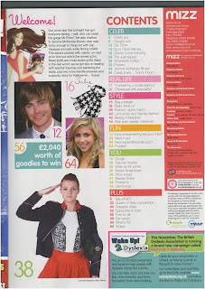
A Contents page analysis of Mizz magazine
- 'Caught out'
- 'Cringe'
- 'Divas'
This is still following the idea that the magazine is trying to be in touch with the readers. Other things such as 'Star Style', 'Bag a bargain', 'Wise up for winter' and 'Banish those blues'. These all appeal to the reader as they are also easy on the eye but are slightly poetic and make it flow easily.
Use of colour - Again the uses of colour on these pages are still vibrant, eye catching and bold. There are still around five colours being used and this probably means that they are following this theme throughout the magazine.
Font styles - Quite a few fonts are being used on this page, especially for the headings. This is probably because they are using different fonts for different topics on this page as they having something about Pussycat Dolls, EastEnders and Zac Efron and David Beckham. This means that the font styles are a way of separating the page in to categories.
Language use - The language used here still follows through from the Top of the Pops front cover that I have already analysed, even if this is not the same issue, the magazine has the same idea throughout all their magazines. They are Using words such as 'Drama', they are using speech boxes from the members of the pussycat dolls to make us feel that we are getting closer to them then we actually are. The language used in these are quite comical.
Images - There are a significant amount of images on this double page spread. This is quite common for Pop magazines as they are aimed at a fairly young audience who would prefer to see more pictures and less writing. Unlike more sophisticated magazines such as Cosmopolitan.
Layout - The main story for this double page spread is Pussycat Dolls taking up 2/3 of the page. There are two other stories on this page which are the far right of this spread. This makes the reader see the main story first then follow through to the less 'important' stories. There are many photograpghs with caption underneath. There is hardly any writing.


No comments:
Post a Comment